


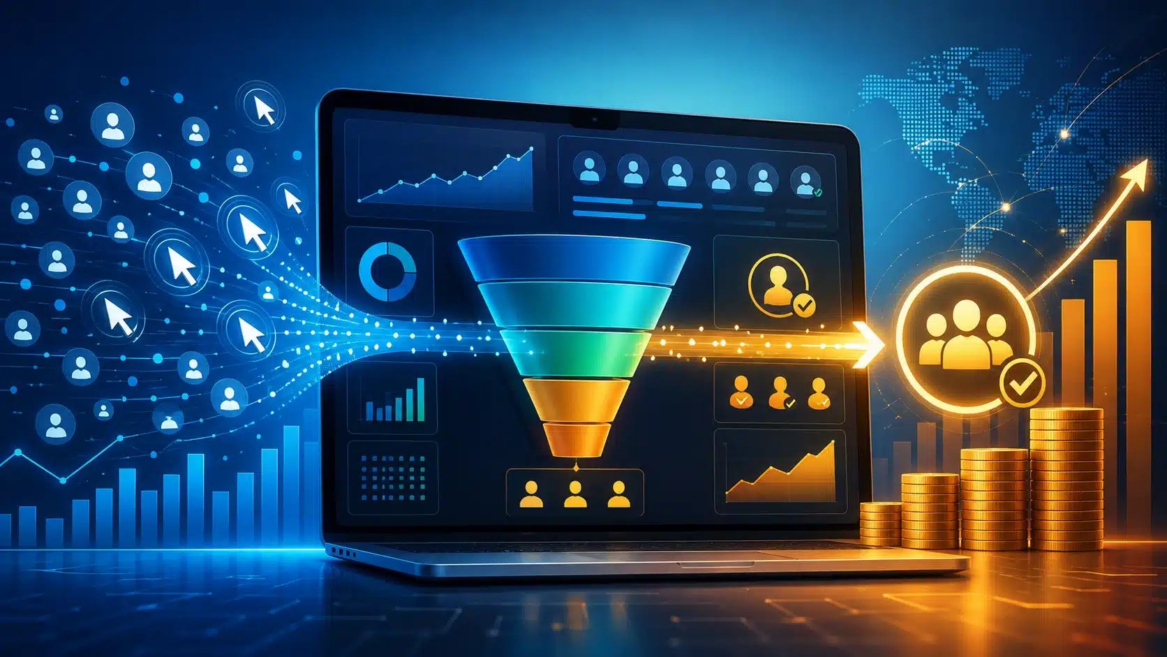
Customers won't tolerate clunky checkouts or vague copy anymore, and your traffic numbers prove it every day. You're getting clicks, sure, but turning them into paying customers takes smarter strategy than ever before. This guide shows you what actually works in 2026, and what's quietly killing your conversions.
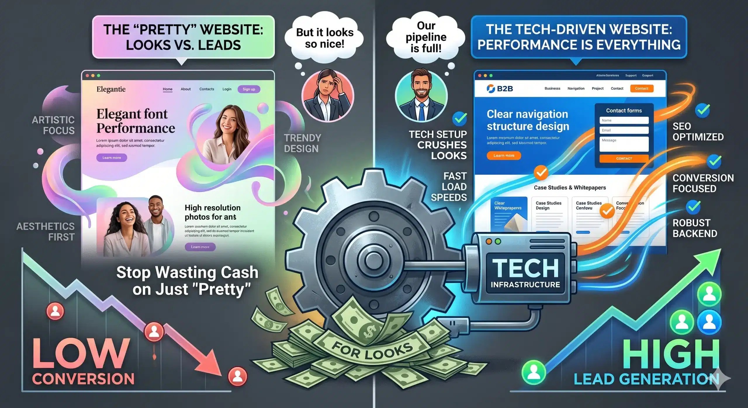
Modern shoppers are faster to bail, pickier about who gets their info, and way more skeptical of anything that smells like a template. Your old playbook of "throw up a landing page and run traffic to it" just doesn't cut it. The tools have gotten smarter, but so have the people using them—and that combo is rewriting what actually converts. If your site isn't engineered for speed, specificity, and genuine trust signals, you're leaving revenue on the table for competitors who understand that SEO and content ecosystems now define digital reputation.
- Speed and clarity still beat clever design tricks. A page that loads fast and gets to the point converts better than one stuffed with animations and pop-ups nobody asked for.
- Social proof only works if it feels real. Generic five-star reviews and vague testimonials don't move the needle anymore; people want specifics, names, and proof they can verify.
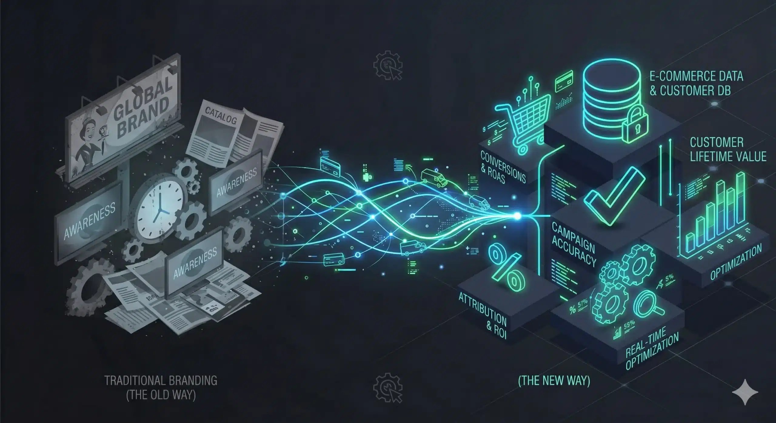
- Privacy changes mean you're flying with less data than before. Cookie restrictions and signal loss mean CRO in 2026 depends more on first-party data and qualitative feedback, not just pixel tracking.
- Your copy needs to serve two audiences at once. Search engines and actual buyers read your pages differently, so text that's stuffed with keywords but ignores how people actually talk will cost you sales.
- Not every A/B test deserves your time or traffic. Small sample sizes and rushed conclusions lead teams to "optimize" based on noise, not real behavior, so picking the right tests matters more than running lots of them.
What's actually changing in the 2026 landscape?
Something's shifted in the past year that you can't ignore anymore. Shoppers are faster to bail, pickier about who gets their info, and way more skeptical of anything that smells like a template. Your old playbook of "throw up a landing page and run traffic to it" just doesn't cut it. The tools have gotten smarter, sure, but so have the people using them, and that combo is rewriting what actually converts.
Honestly, why is your site still so hard to use?
You'd think by now every site owner would've fixed the basics, but nope. People still bounce because a button doesn't look clickable, or a form field rejects a valid phone number for no good reason. Usability isn't a nice-to-have anymore, it's the whole game. If your visitor has to think about how to buy from you, they've already half decided not to.
Why slow loading is the absolute worst: Your load time is quietly killing your revenue right now, whether you notice it or not. Every extra second before your page becomes usable, you lose people who never even see your offer. Patience for slow sites is basically gone in 2026. Mobile users especially will tap away before your hero image even finishes rendering. Testing your actual mobile speed, not just desktop, matters more than most owners admit. A page that feels snappy on your office wifi might crawl on someone's spotty connection at a bus stop, and that's exactly where you're losing the sale.
Why I'm obsessed with the new frictionless checkout tech: Checkout used to be an afterthought, something you slapped together after the "real" design work was done. Not anymore. One-click purchasing, saved payment tokens, and auto-filled shipping details are turning a five-minute chore into something that takes ten seconds. Fewer fields means fewer chances for someone to change their mind. Digital wallets have made typing card numbers feel almost ancient now. Shoppers expect to tap once and be done, so if your checkout still demands a full account signup before purchase, you're handing customers a reason to quit. Guest checkout options paired with smart autofill are doing more for conversion than most redesigns ever could. A polished, high-conversion checkout demands a foundation of solid web design & development that prioritizes seamless user flows.
Every unnecessary field you remove is money left on the table you're finally picking back up. Payment providers now offer plug-and-play widgets that handle verification instantly, so there's really no excuse left for a clunky, multi-page checkout in 2026.
Do people even believe your social proof anymore?
Trust is thinner than it used to be. Shoppers have seen too many five-star pages full of suspiciously perfect grammar, and their gut reaction now is skepticism first, belief second. Your job isn't just collecting reviews anymore, it's proving they're real.
Here's the truth about tracking in a private world
Cookies are basically on life support at this point, and every browser update seems to chip away at what you used to take for granted. You can't just fire a pixel and assume you'll know exactly who did what anymore. That's not a bug in your setup, it's just how the internet works now. So the question isn't how to cling to old tracking habits, it's how you adapt without losing sight of your customers entirely.
What's the secret to getting data without being a creep? Transparency is the whole game here. If you're upfront about what you collect and why, most people don't actually mind sharing a little. Consent banners that explain value, not just legal jargon, convert better than the generic ones. Think of it like a fair trade instead of a sneaky handshake. Context matters more than volume. You don't need every data point on a visitor, you need the right ones at the right moment. Ask for an email after someone's engaged with your content, not the second they land on your page. Timing turns a request into a natural exchange rather than an ambush.
Why zero-party data is actually your best friend: Zero-party data is the stuff customers hand you willingly—quiz answers, preference selections, survey responses. Nobody's guessing here, they're telling you outright. That kind of honesty is worth more than a dozen inferred behavioral signals because it's accurate by definition, not by assumption. Quizzes and preference centers aren't gimmicks anymore, they're data collection tools disguised as helpful features. Give someone a reason to answer three questions about their needs, and you'll segment your funnel better than any cookie ever could. Building this into your site doesn't require a huge overhaul either. A simple "what brings you here today" dropdown on your homepage, a post-purchase survey, even a preference toggle in your account settings—all of it feeds a profile your customer actually approved. Leverage marketing automation services to activate this zero-party data across your nurture sequences.
Is your copy talking to humans or search engines?
Stop writing like a corporate manual, seriously: Read your homepage out loud right now. Does it sound like something you'd actually say to a friend, or does it sound like a lawyer wrote it after three coffees? Too many brands still lean on phrases like "best-in-class solutions" or "synergistic offerings" because it feels safe. It's not safe, it's invisible. Visitors skim right past jargon because their brains have learned to filter it out. Your copy has one job: make someone feel understood in the first five seconds. A mid-sized software company recently swapped "leveraging cutting-edge automation" for "we handle the boring stuff so you don't have to." Same product, wildly different reaction. Which one would you rather read?
My favorite tricks for making your copy sound like a person: Start by writing your headline the way you'd text it to a coworker who's in a hurry. Short sentences win. Contractions win. If a sentence needs a comma and a semicolon to survive, kill it and start over. Ask questions in your copy, too—real ones, the kind your customer is already asking themselves at 11pm while comparing options. Swap abstract nouns for concrete verbs whenever you can. "Optimization of workflow efficiency" becomes "get your tasks done faster." It's a small shift, but it changes how trustworthy you sound instantly. Try reading your page copy next to a chat transcript from your own support team. Support agents naturally say things like "yeah, that happens a lot" or "here's the quick fix." That tone builds trust faster than any polished paragraph ever will, and it works because it mirrors how your customer actually talks, not how your marketing team wishes they talked. For distribution of this human-first copy, integrate with social media services that amplify authentic brand voice.
Why your A/B tests might be wasting your time
Plenty of teams still run tests like it's 2018, and that's exactly the problem. You slap a button color change live, wait for a "statistically significant" result, and pat yourself on the back. But your traffic has changed, your visitors' patience has changed, and honestly, most of what you're testing doesn't move the needle anymore. It's time to get a lot more honest about what's actually working.
Small infrastructure changes, like lazy loading images below the fold, can swing results just as much as any headline rewrite, and most teams never bother checking that.
FAQ
Ready to turn your 2026 traffic into a conversion machine that actually delivers?
At iWebHacks, we combine behavioral analytics, zero-party data strategy, and frictionless UX design to transform your website into a revenue engine—even as privacy rules tighten and customer patience shrinks. From checkout audits to copy that sounds human, our team helps you extract maximum value from every single visit.
Don't let clunky pages and generic messaging quietly kill your conversions. Our systematic approach ensures every landing page, CTA, and trust signal is optimized for measurable growth. See how we've helped brands increase conversion rates and build resilient digital pipelines that thrive in the new landscape. Explore our industry-specific digital ecosystems to see what's possible.
📘 Explore related resources: SEO Services · AI Automation · Web Design & Development · Marketing Automation