5 Tiny Design Tweaks That Will Double Your Contact Form Submissions (No Code Needed)
Optimization hit you in the face the first time you watched someone hover over your contact form… then bail at the last second, right? These five small design changes quietly pull people through to “Submit” without touching a single line of code.
Key Takeaways
- Shortening your form to just the necessary fields can lift completions by 30% or more.
- Clear, benefit-focused headlines above the form guide visitors instantly.
- Big, high-contrast buttons with action-driven copy nudge people to click.
- Micro trust signals calm last-minute doubts so people feel safe hitting send.
- Small layout and spacing tweaks make the whole experience feel easier and faster.
What’s the Deal with Contact Forms?
Your contact form is basically the front door to your business online, and tiny tweaks here can quietly add 20% to 100% more leads without you touching your ad budget. You’re not just collecting messages, you’re filtering intent, qualifying visitors, and routing revenue opportunities while you sleep.
When you strip friction, fix copy, and align fields with what people actually want, you stop treating your form like a boring utility and start using it like a silent sales assistant that never takes a day off.
Different Types of Contact Forms
You’ve probably seen more types of contact forms than you realize, each one nudging visitors toward a slightly different action with its own quirks.
| Form Type | Best For |
|---|---|
| General contact | Simple inquiries, partnerships, media requests, or a flexible catch-all form. |
| Support/helpdesk form | Routing customer issues with fields for order numbers, account IDs, urgency, and topic. |
| Quote/estimate form | Agencies and service businesses capturing scopes, budgets, and timelines before a call. |
| Consultation/booking form | Scheduling calls, demos, or visits without endless back-and-forth. |
| Feedback/survey form | Collecting user insights, NPS scores, or product feedback that improves offers over time. |
Why They Matter for Your Business
Every contact form submission is basically a tiny sales conversation you didn’t have to start yourself, and that compounds fast. In one client test, cleaning up a bloated form increased monthly leads from 32 to 71, with the same traffic and the same offer.
When you design forms to qualify, prioritize, and route leads, you protect your time while increasing close rates, instead of stuffing your inbox with noise.
My Top Tips for Boosting Submissions
- Primary button that stands out visually.
- Fewer fields to cut friction.
- Outcome-focused headline above the form.
- Short trust note under the button.
- One-change-at-a-time testing approach.
Small form tweaks often outperform massive redesigns. Fix three tiny friction points, then watch submissions climb.
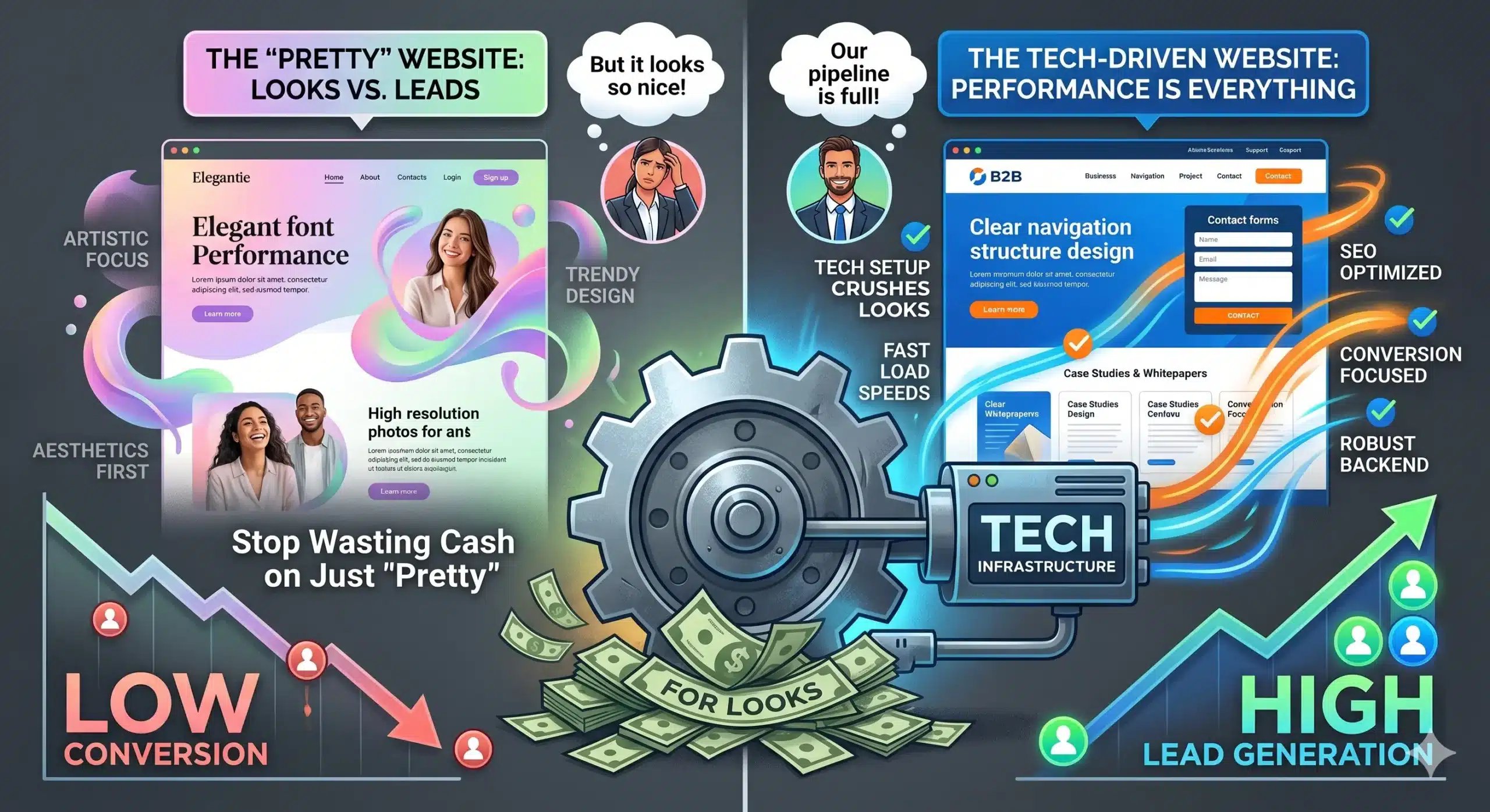
Simple Design Tweaks That Seriously Work
Most contact forms get a quick 15–20% lift just by making the submit button impossible to miss and the labels stupidly clear. Shift to a high-contrast color, increase the button size, and replace vague copy like “Submit” with “Get your quote” or “Request pricing”. Trim any field you don't absolutely need.
How to Make Your Form More Inviting
It still surprises people that a tiny line of microcopy under the headline can feel like a warm handshake and lift signups by 12% or more. Use benefit-first wording, such as “Get a response in under 24 hours,” and pair it with a friendly, human tone.
Here’s the Step-by-Step on Making Changes
| Step | What to Do |
|---|---|
| Clarify your form goal first | Pick one goal (book a call, request a quote, send an inquiry) and align every field and button to that outcome. |
| Rewrite labels in plain language | Use human wording (“Phone number”, “Work email”) and ditch stiff phrases. |
| Shorten visible fields first | Start by removing low-value fields and keep 3–5 essential ones for the first step. |
| Adjust spacing for easy scanning | Increase vertical spacing slightly and bump input height for mobile. |
| Make your button visually dominant | Use a contrasting color, clear outcome copy, and full-width button on mobile. |
| Add one short confidence line | Drop a line like “We reply within 24 hours and never share your info” beneath the button. |
Pros and Cons of the Changes
| Pros | Cons |
|---|---|
| Higher submissions from fewer fields, clearer copy, and a standout button. | You might collect less detailed data upfront which can affect lead qualification. |
| Cleaner layouts reduce cognitive load, improving perceived trust. | Visual changes that feel too aggressive for your niche can look salesy. |
| Microcopy around privacy or response time reduces anxiety. | Poorly phrased microcopy can accidentally raise suspicion. |
| Subtle color and spacing tweaks help your button stand out. | Overusing bold colors can clash with your brand and distract users. |
| Shorter forms are faster to complete on mobile. | Sales teams may get less context and must adapt follow-up processes. |
Weighing the Benefits Against the Effort
On a pure ROI basis, you’re playing in easy mode here: a few tiny tweaks that take 30 to 60 minutes can outperform a full redesign you’d spend weeks arguing about.
My Take on Best Practices Going Forward
Small, consistent tweaks beat one big redesign every time. Run one change at a time, track submissions week over week, and screenshot your form before/after each tweak so you can see what moved the needle.
Turn your contact form into a real conversion asset
To Wrap Up
With these considerations in mind, tiny tweaks add up to a big bump in form submissions. You’re not rebuilding your site, you’re just nudging your layout, copy, and visuals so your visitors feel safe, focused, and motivated to hit submit.
Written by Jason
Full-stack marketer and conversion-focused web designer helping businesses turn “boring” pages and forms into always-on revenue engines.